
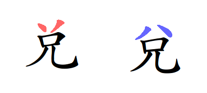
Right = Taiwan
Have you ever noticed that there are sometimes slight differences between how Chinese characters are displayed on different devices? Or that some characters in printed books are different from those you use on your computer? If we add different ways of displaying simplified and traditional characters, it becomes even more complicated!
In this article, we’re going to look closer at the problem of displaying Chinese characters. It’s not really something you can “solve”, but being aware of what/s going on certainly helps.
Different standards and fonts
The root of the problem is that there isn’t one single standard for how Chinese characters should look, especially not if we consider the fact that standards change over time. What used to be the right stroke order or way of writing a character can become obsolete or change for various reasons.
Of course, that doesn’t mean that everybody changes their way of writing to follow the new standard. The same is true for fonts, which means that most fonts out there don’t follow the standard 100%.
The differences are usually small, though, and not something you really noticed if you can already read and write Chinese. Think of it as different ways of writing the letter “g”; most people probably don’t write it the way it’s usually displayed on computer screens, but we don’t really think about it that much and it certainly isn’t a problem. We can easily imagine, however, than it might cause problem for someone learning the alphabet and wants to know what’s up with the different versions.
Simplified and traditional Chinese
The correct way of writing certain characters and character components differs between simplified Chinese and traditional characters. This goes beyond the basic differences between the two character sets, which is another topic entirely. I’m not talking about character simplification here.
This means that a character that isn’t simplified can still be written differently in the two systems, while still being considered the same character! Think of the letter “g” again and imagine that the US and British governments decided to write them in two different ways. It’s still the same letter.
For example, the character component 兌 is written differently on the Mainland and in Taiwan. In Mainland China (left, red highlighting), the dots slope in towards the middle, whereas in Taiwan (right, blue highlighting), the dots slope outward. Like this:
It’s still the same character, though, so this isn’t a simplified/traditional issue. To show font differences in this article, I have used pictures rather than text, since the text would depend on what fonts you have installed. I have used these fonts for the pictures:
If you want a more comprehensive discussion, including more examples of differences between Mainland China, Taiwan, Korea and Japan, please check this article on Wikipedia: Variant Chinese characters
Skritter and font issues
The basic stroke order and character writing we support on Skritter is the Mainland Chinese standard for writing simplified characters and most characters we have follow this standard. If you find characters that don’t, please report them so we can fix the issue!However, there might still be display problems in Skritter, because we can’t control how your device displays the Chinese text in the app, only the characters you write and that we display as you write. This means that if your device is set to display characters in a certain way that doesn’t follow the standard, the character you write and the one displayed in the character info won’t be the same. You should always trust the characters you write in Skritter, not those that appear as normal text!Traditional characters in SkritterWe also have full support for traditional characters, so you can select which set you want to learn, or even learn both at the same time. However, we can only display a specific character in one way.That means that we can have two different writings for 义 and 義, because they are two different characters (one is simplified, the other is not). However, we can only have one way of writing 兌, even though the Mainland and Taiwan ways of writing are different.
At the beginning of this article, I included a list of character differences between Mainland and Taiwan standard. None of them should cause too much confusion when you read, but it’s good to be aware of them when you write!
We have chosen to be consistent in these cases, so even if 说 and 說 are two different characters and we could in theory display the right part 兌 in two different ways, we still enforce the Mainland standard on both. Why?
Because if we look at characters like 兌, we (can) only support one version (Mainland China). To avoid confusion, we have chosen to always write that character component in that way, even if it’s technically wrong according to the Taiwan standard. We believe this is the least bad situation.
How to deal with font issues as a learner
As I said in the introduction, this isn’t really a problem you can solve. Even if you set your computer and phone to show exactly the characters you want, you will still face non-standard fonts everywhere, not just when you go from Taiwan to China or vice versa. You will get used to these, so don’t fuss too much about the differences. My suggestion is that you learn to write one version, the standard, and that you learn to recognise the others.
If you’re not sure what the standard is, check an authoritative dictionary or install the fonts I mentioned above!