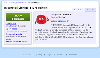
![]() Ah the list page, we meet again. This page has been giving us trouble ever since the very beginning. Each time we get a little closer, but still just not up to par. We did a fair amount of testing on the last one version, and just about each and every time, the tester ended up frustrated and confused and not doing what we hoped they would.
Ah the list page, we meet again. This page has been giving us trouble ever since the very beginning. Each time we get a little closer, but still just not up to par. We did a fair amount of testing on the last one version, and just about each and every time, the tester ended up frustrated and confused and not doing what we hoped they would.
So with all of that in mind, we set to rearrange things once again. We pulled the list of “More Actions” out of a dropdown and put them on the left side, where the various actions could easily be seen. We moved the list of sections into a tab, hidden when the page is first opened. And we made the study button as big and unavoidable as possible! It is after all the most important part of the page. We did some other tweaks and changes, but those are the big ones.
We made these choices because, time and again, users would miss the big green study button which would solve all their problems, and instead they went on to the individual section pages, then they didn’t know what to do. Some ended up cramming the section, which lead to an annoying repetition of the same words over and over again and an unmanageable list of sections in the study nav. Others selected all the words in the section and added them to the queue, leaving the study nav empty. And neither of these routes used the full organizational power of Skritter.
George is lining up some more testing so we can see what exactly happens when new users tackle the new setup. We’ve got our fingers crossed!
Designing a good interface is hard.

