![]() Last summer, Nick, George, I, and two of our interns, Maksym and Patrick, had a series of long and spirited discussions about several key parts of our site. Our goal was to rework all the things that were still giving people trouble (like the list system, oh how the list system has always caused confusion). After several weeks of heated debates, we finished up the designs for several reorganized pages, along with plans for some general restructuring of the site.
Last summer, Nick, George, I, and two of our interns, Maksym and Patrick, had a series of long and spirited discussions about several key parts of our site. Our goal was to rework all the things that were still giving people trouble (like the list system, oh how the list system has always caused confusion). After several weeks of heated debates, we finished up the designs for several reorganized pages, along with plans for some general restructuring of the site.
That was the end of August, and since then I have been spending most of my time implementing all these changes. And now they are ready to be tested! Nick has already gone through the new stuff and found a boatload of bugs which I’ve fixed, but inevitably there will be more. For those of you who want to give these changes a try and help us find the remaining bugs, enable alpha testing in your account settings and have a look around. We want to hear what you think!
Here’s a quick rundown of the changes we’ve made:
- Study Nav: The biggest change here is the removal of single section cramming, though you can still study individual sections from the list’s section pages. We did this to encourage people to study all their lists or individual lists, since that is much more efficient, and many new users find themselves studying sections without realizing they can study whole lists.
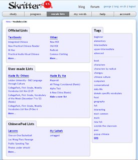
- Vocab List Nav: Major overhaul here. Now it shows a sample of each of the kinds of lists available to you and a handful of tags are shown on the right, making them much more visible than before. Now this page gives you a better overview of what kinds of lists are available for study.
- Vocab List Page: What redesign would be complete without an overhaul of the list page? This time we think we’ve got it; there are a lot of little things here that should make it easier to navigate. We’re anxiously waiting to put this through some UX testing to see if it holds up. What is this, the sixth version of this page? We have honestly lost count.
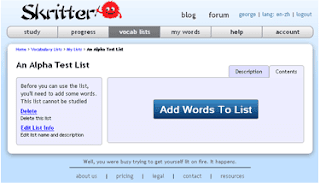
- List Creation: The whole process of making new lists has been redone from the ground up. From choosing the title to putting in the final words, we worked to make it an intuitive and understandable process from start to finish, with information bubbles helping users along step by step.
- No-Section Lists: Many lists people make are on the small side, so now you can eschew multiple sections and build a list that only contains one set of words. Note that these are limited to 200 words each, just as single sections are!
- My Words: We are introducing a new concept, to help new users get used to how Skritter works. When words are added from lists, they are added to a big pile of words to be studied all together (when you study “Everything”). That pile of vocabs is called “My Words” and all the viewing and manipulating of “My Words” is done in this new section of the site. It even comes with search functionality! We give props to Maksym for thinking this up.
So there’s not much here in terms of functionality. Even “My Words” is just a name; what it represents is how the system has always worked. The central focus of all these changes is usability; we want to make sure new users can quickly find their way around the site and be able to use all the neat features we’ve built over the years. After all, what good are features if you can’t find them, or figure out how they work?
Unintuitive interfaces have been our perennial problem. We’ve answered countless emails from many confused users having difficulty studying and making lists, processes which are pretty central to using Skritter effectively. And we know many more probably didn’t even bother to contact us to figure it out. We hope with this major push, we’ve made a good deal of progress toward having an easy to use site.


