![]() So, after about a week of alpha testing we’re pushing all these changes live for everyone. Most everything is the same as before, it’s just rearranged and organized better, and hopefully easier to use.
So, after about a week of alpha testing we’re pushing all these changes live for everyone. Most everything is the same as before, it’s just rearranged and organized better, and hopefully easier to use.
Since I already went over the biggest changes in my last blog post, I’m going to go more in depth and describe each of the major changes in a series of blog posts. First up: the study navigation page, i.e., where you go to choose what to study.
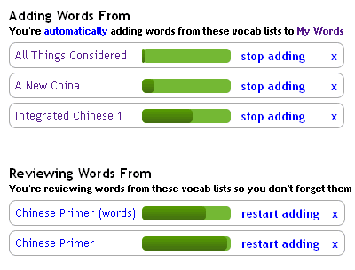
One of the largest changes to this page is how we display the lists being studied. They’re now split into two groups. The first group includes lists that from which words are currently being added. The second group includes just those lists that are being reviewed. Each list has a toggle so you can quickly move them between adding and just reviewing. This has the same effect as the play/pause buttons in the practice page did in the old system, but if you have seen the recent poll, you can see most people didn’t know they were there! We’ll see if moving this functionality front and center fixes that.
Here are some of the other changes:
- Each list has a total progress bar instead of the last studied date.
- The Scratchpad is now a popup, to de-emphasize it, and it no longer saves what was studied last
- Sections studied are no longer shown, also to put less emphasis on it.
- “Practice” has been replaced with “Study”, here and throughout the site
By the way, thanks to all the alpha users who found all the nasty bugs in these new pages and providing helpful feedback. We made a bunch of tweaks based on your input.
There will be more posts about the other pages in the next few days!