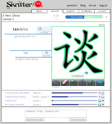
![]() For the past year, and some odd months, the practice page had remained largely the same. Every time you would go to practice, you would be greeted by the following screen:
For the past year, and some odd months, the practice page had remained largely the same. Every time you would go to practice, you would be greeted by the following screen:
 It was great, but it quickly became outdated. We kept tacking on features until it became obvious that to accommodate the next few features, we’d have to put menus inside menus and tabs on tabs on tabs. So we created a new one, one with which many of you are now familiar. But today marks a milestone, the old practice page is no longer going to be accessible as of later tonight, so here’s the new design, and a few of the things that we changed:
 So here are some of the big changes:
The Toolbar
On the old toolbar, the “show” button was represented by the character 示. On the new one, we tried to make it more apparent what the button would do by making the icon a “?.” By popular demand, we added a back button so that if you ever accidentally proceed forwards too quickly, you can always go back and complete items.
You might notice that the “undo” button no longer exists although you can still press “z” to use it. The undo button has actually been obsolete since about this time last year. We attended the ACTFL last year when Skritter was new and the strokes didn’t auto-snap. The undo button was built mainly to allow users to correct their mis-recognized strokes and remove out-of-order strokes. Through UX testing and the addition of stroke level snapping, the undo became obsolete, which is good, because we needed the room on the toolbar for the new “Back” button!
Better Lookup and Vocabulary Controls
 Many people have requested that we let make it easy for people to look up vocabulary on external sites. Well, now you can choose from six Chinese or five Japanese dictionaries. This window also gives you the ability to see from where items come.
You can also delete individual words without going to the vocabulary page for that list. Finally, if a prompt has an item not currently in your review list, you can add that item from within this menu by clicking on the “+” button. In this example, I had added the word, but not its component characters.
Improved List Management
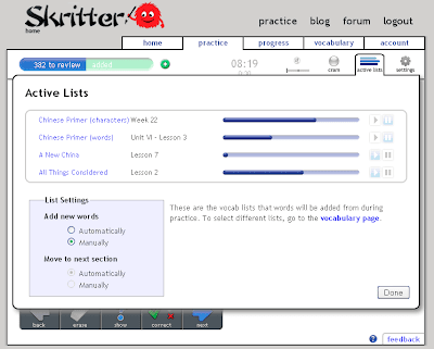
 The removal of the active list area at the bottom of the old practice page made it necessary to relocate the active list display. But we didn’t just move it, we consolidated the practice settings page, making it easier to figure out where you need to go to change your vocabulary options.
We’ve also changed how you let Skritter add items for you to study. Now you can choose to either let Skritter manage the adding itself (Automatic), or you can pause all lists and add words manually (Manual) using the green “+” button.
You’ll notice that there’s also a link to the vocabulary page. When we were UX testing, a lot of people thought they should control vocabulary from the practice page. Since it’s currently infeasible for that to occur, we thought we’d try and point new Skritter users in the right direction.
Succinct Settings
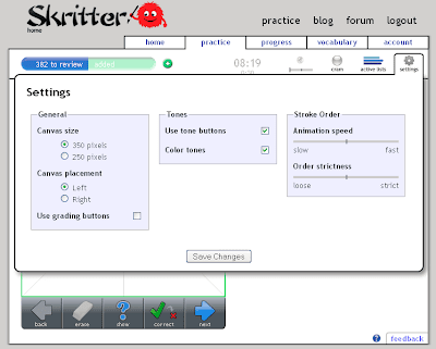
 We wanted the options for the practice page to be accessible on the same page as the functions they affect. On the old practice page, to change your flash window size, you had to navigate to account>practice settings, save, and navigate back. Now the same change requires three clicks and one page load as opposed to five clicks and two page loads.
The new settings menu also lets you activate tone colors, grading buttons, and allows you specify how quickly characters are animated. The tone colors option is new, and serves as just another way to aid memory. It changes the color of the pinyin in the prompt to correspond to a color so that you can remember that shāngdiàn is red, then blue.
The grading buttons give you greater control over how Skritter schedules reviews for you. The buttons are based on the Anki self-grading system. If you want to make sure Skritter knows exactly how well you know a prompt, turn this option on and never over-review an item again.
Finally, setting the animation speed governs how quickly characters are revealed when you hold down the show button. If you only want to know the next two strokes of a character, but don’t want to see the entire thing, set the speed low and hold down the “show” button for a second. This will force yourself to remember more with less prompting.
The settings menu is going to be expanding in the future as we complete more features, so look for this one to grow with time.
Cram and Scratchpad
 Both the cram mode and the scratchpad have been made into options that are accessible through the all-powerful practice page. Because Cram mode was essentially just practicing a small subset of your items to review, and the scratchpad did the same thing but didn’t record progress, we decided the two modes were more conducive to existing side by side with the regular practice page. As such, you can simply change the behavior of the practice page to act like the cram and scratchpad now.
Dfor now you can still get to the old scratchpad by going to www.skritter.com/scratchpad.
Conclusion
This update has been a long time in coming, and we’re very excited to finally make the transition to our shiny new interface. Let us know if you find anything wrong with it, or you would like to suggest improvements!

