![]() I’m sure that some people have had troubles navigating the site. You might even have had problems doing something that seemed like it should be a really simple task. In some rare cases, users might even have been a little frustrated with our placement of buttons, lack of documentation, and inconsistent use of design elements. You get extra points if you read the preceding paragraph and understood I’m being pretty sarcastic. In truth, we’ve known for a long time that the usability of the site is pretty bad and it’s a big problem. We want the site to grow and prosper, but it’s hard for users to get really hyped about Skritter if they get to the practice page and can’t figure out what they are supposed to be doing.
I’m sure that some people have had troubles navigating the site. You might even have had problems doing something that seemed like it should be a really simple task. In some rare cases, users might even have been a little frustrated with our placement of buttons, lack of documentation, and inconsistent use of design elements. You get extra points if you read the preceding paragraph and understood I’m being pretty sarcastic. In truth, we’ve known for a long time that the usability of the site is pretty bad and it’s a big problem. We want the site to grow and prosper, but it’s hard for users to get really hyped about Skritter if they get to the practice page and can’t figure out what they are supposed to be doing.
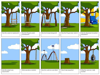
That’s why we’ve been spending a considerable amount of time and energy doing 1 on 1 usability testing with students and members of the community around Oberlin. We got the idea after reading Steve Krug’s Don’t Make Me Think, and it was good that we started now before we added too many more features. The results of our tests are truly frightening. Before I get into some of the lessons, here’s a comic I’m sure many of you have seen, but sums up our design process pretty well:
We have tested the site two times so far and will continue to do so. The first group of 8 found so many problems that we waited five weeks fixing things up, and then tested again with another 5 people to see if we could complete a full session without getting derailed a distracting number of times. We used primarily college students, since they don’t require $50 to hire them for an hour and we don’t know as many “real” adults. Here are some of the stats we found interesting:
Login Woes
12 of our 13 testers tried signing up using the returning user sign in rather than the “Create a New Account box” on the login screen. The 13 had to re-type their account info.
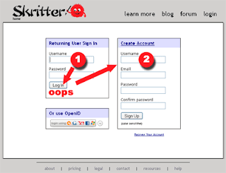
In retrospect, this design should have very obviously been a bad idea. We thought: what do user do most of the time? Login, not sign up! We’re helping users!
But at the same time, we are forcing the vast majority of new users to type their information twice, which drastically increases the time it takes to sign up, which is obviously the most vulnerable part of our site. Our plan is to split the login and sign up pages so that we can include testimonials for people to look at while they’re considering whether to sign up, like so:
Branding Woes
Only 1 of our 13 testers understood that the little fuzzball in the top left was our mascot. Several people liked it, several didn’t, which is consistent with such a small sample.
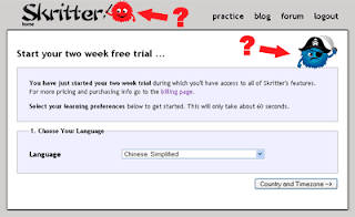
Several users mentioned that if we had made the mascot more pervasive, ie, it appeared on more pages and seemed more integrated with the UI overall, they would have eventually assumed it was an intentional branding message. As it stands now, most people said they either liked or disliked “whatever those puffballs are.” That needs some serious work.
Can you pay for Skritter?
We’d like you to help support our endeavor, here, try Skritter for two weeks free! You like it? Great, why don’t you pay? Ooops, couldn’t find anywhere to pay? Too bad. Only 6 of our 13 testers were able to find the billing page on their first attempt. You could have paid us in two spots on the site:

Great, nobody can see those, and our top nav has dropdowns on some items and not others, so we changed it so that the “billing” link was a little more visible on the home page, like so:
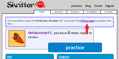
We also added a not-so-subtle highlight to the account page:
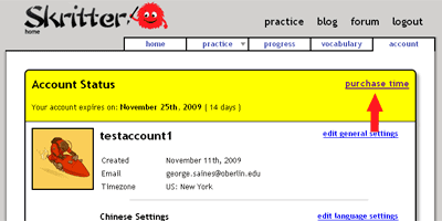
To make it effective, we’re going to have to continue iterating until our success rate increases, but hopefully we’re moving in the right direction.
Let’s Make a Movie
By the time the second group came to visit our site, we had constructed a shiny new “lean more” page, decked out with everything anyone would need to know about Skritter. We even had a video that we made in the style of FogBugz. We opted for a non-standard flash UI since we figured our app was flash heavy and it would look bad for us to simply use a Youtube embed. Here’s a picture of what we ended up using:

We learned several things from our experiment. First, we aren’t FogBugz, and we misread the context of their video. The demo of version 6’s features isn’t accessible via their homepage, and for good reason: it’s long, and only dedicated folks will want to watch a 12+ minute demo. We thought, “Ah, but we’ll just shorten ours to 4 minutes and the dedicated will love it!” Actually, nobody loved it, because nobody in our testing groups watched it. I take that back, there was actually one tester who watched it . . . for about 8 seconds. Lesson: such a video should not be placed front and center when trying to convert traffic.
Second, we learned that despite a more sleek interface, people didn’t quickly understand it was even a video. Several recommended using a standard Youtube embed because it would be easily recognizable as a video, and it displays the run time up front! Okay, okay. We thought our little snarky tooltip would handle that, but apparently not.
Closing Thoughts
We aren’t done with group two yet, we want to have several more people check it out before we regroup again and make changes, but so far we’ve been able to make a lot of really needed usability tweaks. The ones included above are just the tip of the iceberg, there were tons of process-oriented problems that would have been time-consuming to explain with screenshots that we discovered were causing people anguish. We plan to keep testing regularly, as per Steve Krug’s recommendation until the site becomes easy to use and intuitive.
Thanks to everyone for putting up with the problems. We look forward to making everything a lot easier to use.

